Restaurant website design: make the first welcome count
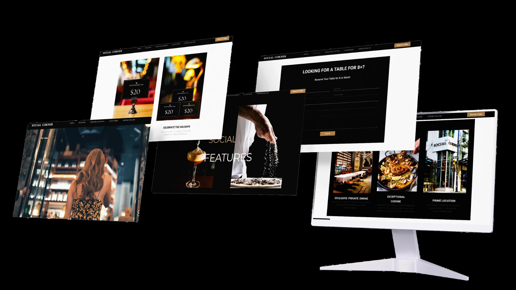
Start with the guest’s next decision
A restaurant website has two jobs that should support each other: communicate the character of the place and help a guest decide what to do next. Beautiful imagery creates expectation. Clear menus, location information and reservation links turn that expectation into a practical journey. Start a design brief by listing the questions a first-time visitor needs answered. What kind of place is this? What is on the menu? Where is it? Can I book? The answers should be easy to find without stripping away the personality of the brand.
Design the mobile journey deliberately
A desktop composition can feel generous and cinematic, but that does not automatically make it useful on a phone. Review the mobile experience as its own sequence. Keep the restaurant name and location clear. Make navigation comfortable to use with one hand. Let guests inspect the food and drinks without pinching a tiny image. Use enough contrast for text over photography. Motion should contribute atmosphere while leaving the next action obvious.
Give every location a clear identity
For a group with several locations, avoid leaving guests to infer which menu, address or booking link belongs to which room. A location page can combine the setting, practical details and a direct route to the relevant reservation destination. The visual system can stay consistent while each venue keeps its character. This is particularly useful when a brand has different opening hours, dayparts or menus across locations.
Make the menu part of the website
A menu deserves more thought than a file buried behind an icon. Present its categories clearly, make changes easy for the team to maintain, and consider how the content reads on a small screen. A downloadable menu may still be useful, but the browsing experience should not depend on a guest wrestling with a large print layout on their phone. The right balance depends on the menu, the platform and the team’s update workflow.
Measure actions with clear definitions
Before a launch, decide which actions matter and how they can be measured. GA4 supports marking meaningful events as key events. A click on a reservation link, however, is not automatically a completed booking. Keep those definitions separate in reporting, and confirm what the reservation platform can actually share. A useful review asks whether guests can find the right information and continue their journey—not merely whether the page looks impressive.
Further reading: GA4 key-event documentation.
Apply the same discipline across locations
Fernando’s hospitality work includes website updates, menus and promotional communications across Acquafarina, Social Corner and Ciclo. A practical lesson from that scope is to treat location information as maintained content, not something finished at launch.
For each venue, keep a checklist covering its address, opening hours, menu destination and booking link. When a campaign changes, review the landing page and the guest-facing information together. That helps a team find inconsistencies before visitors have to interpret them.
Explore the hospitality portfolio ↗